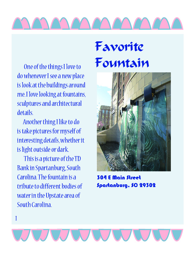
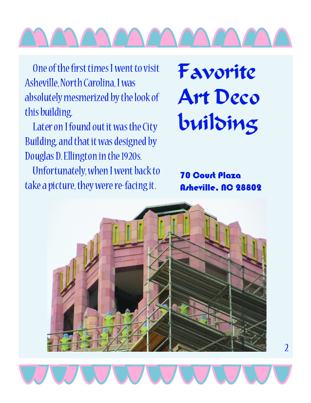
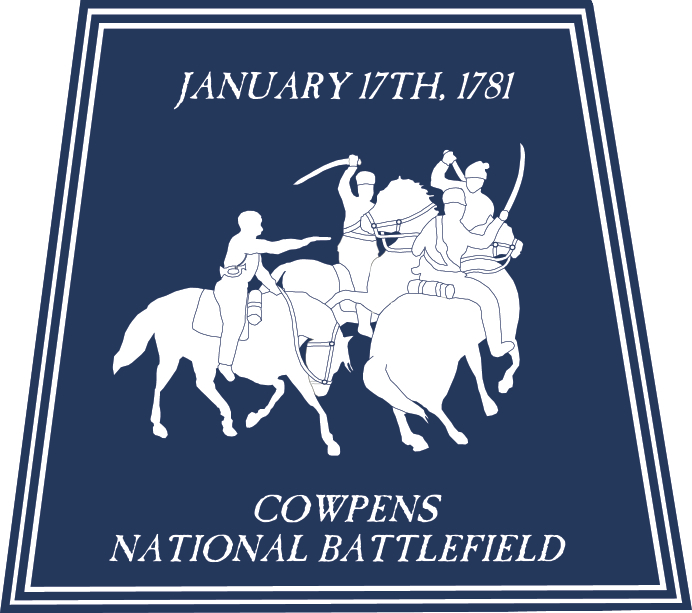
Cowpens National Battlefield
Spartanburg Community College
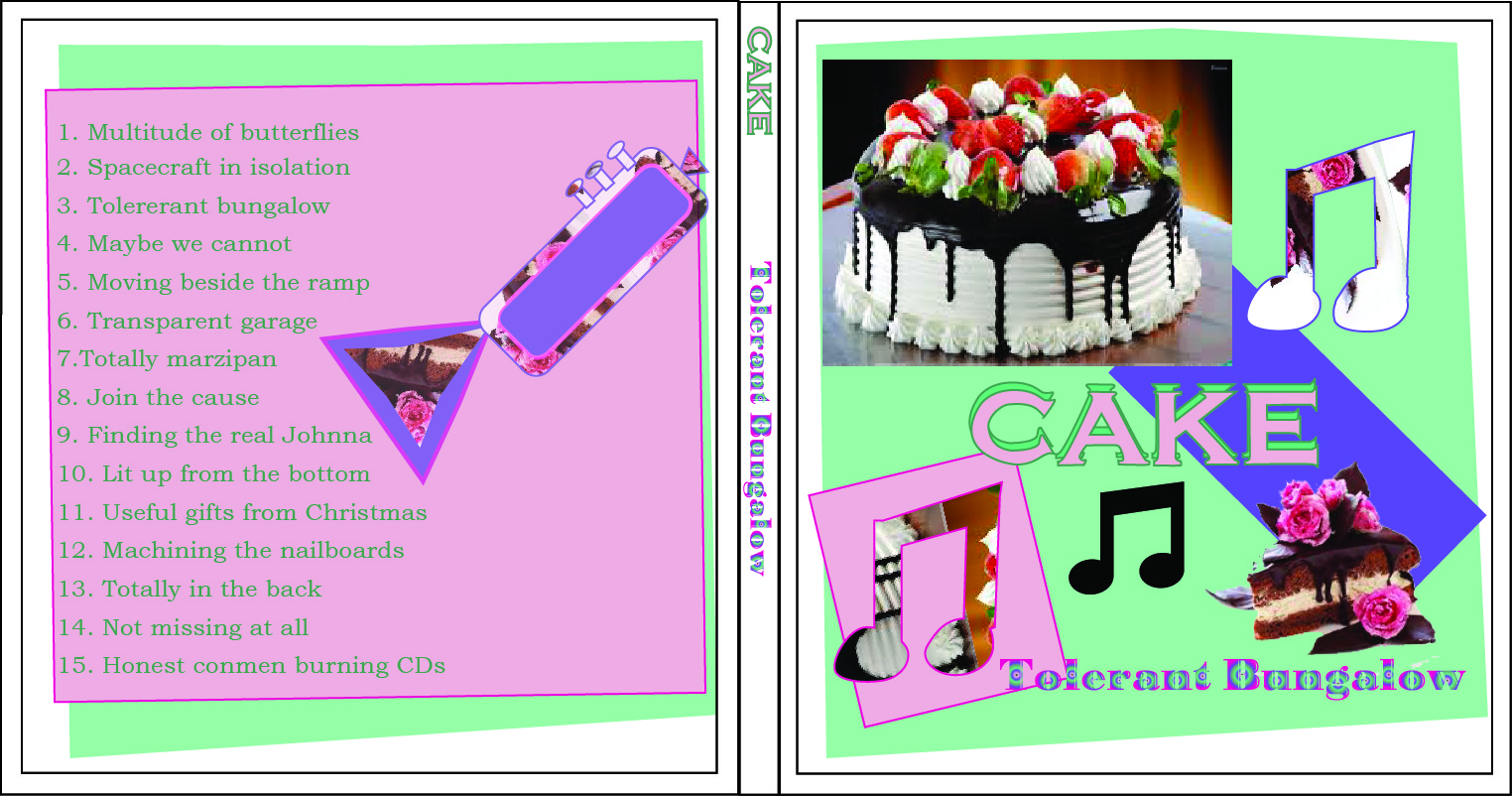
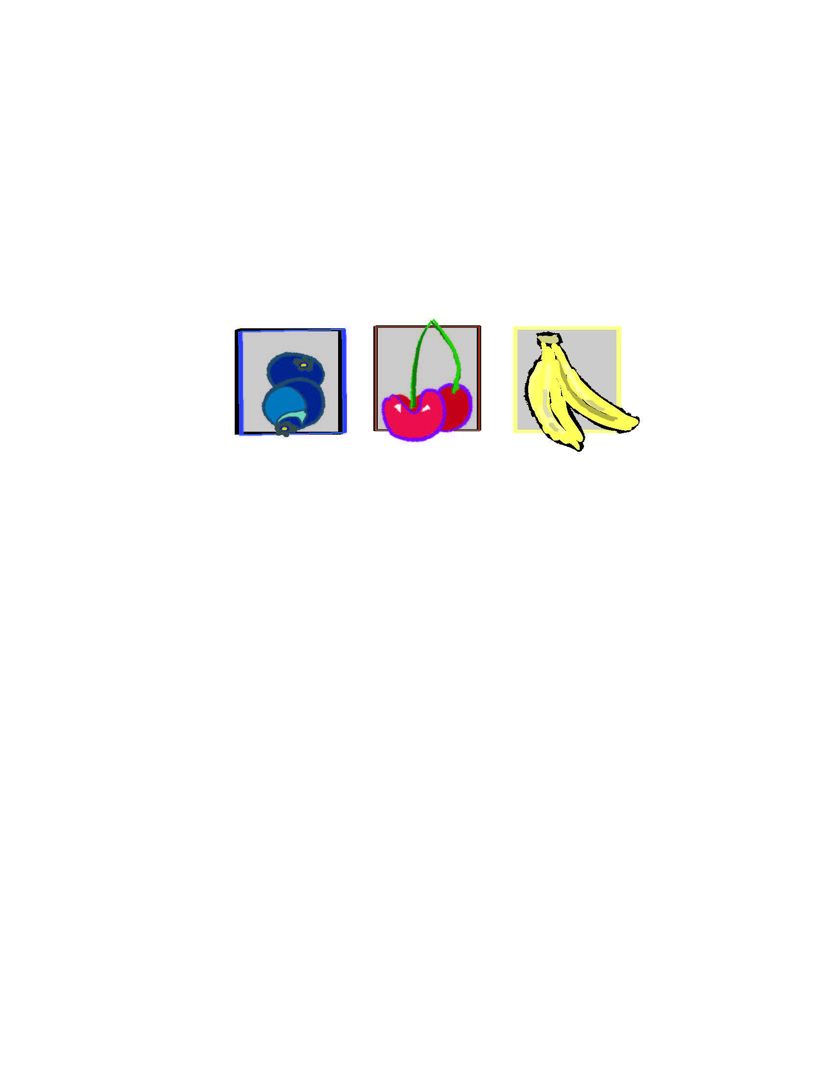
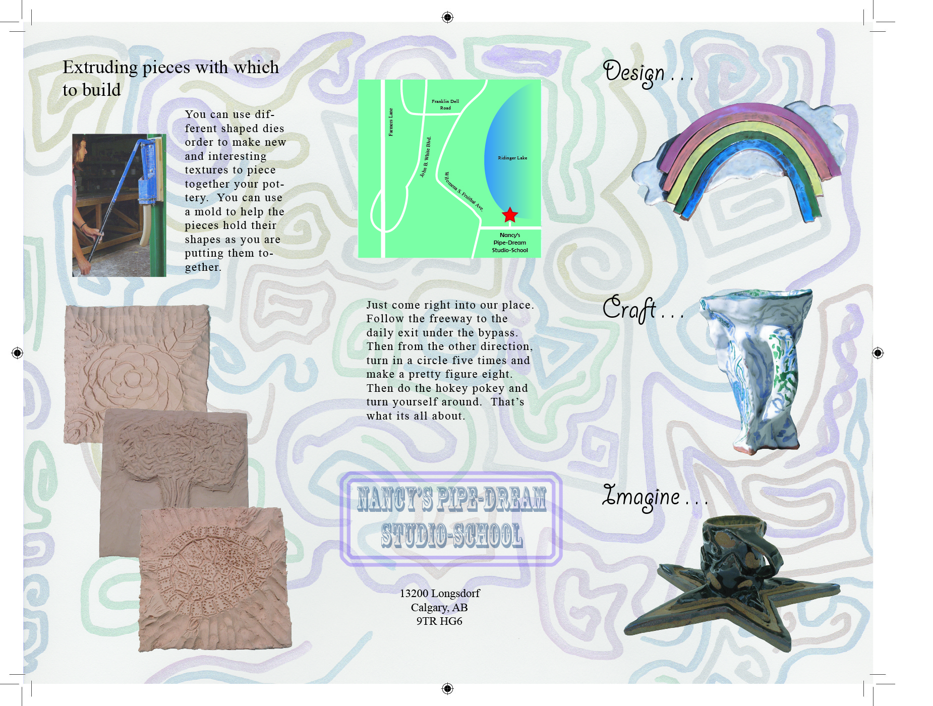
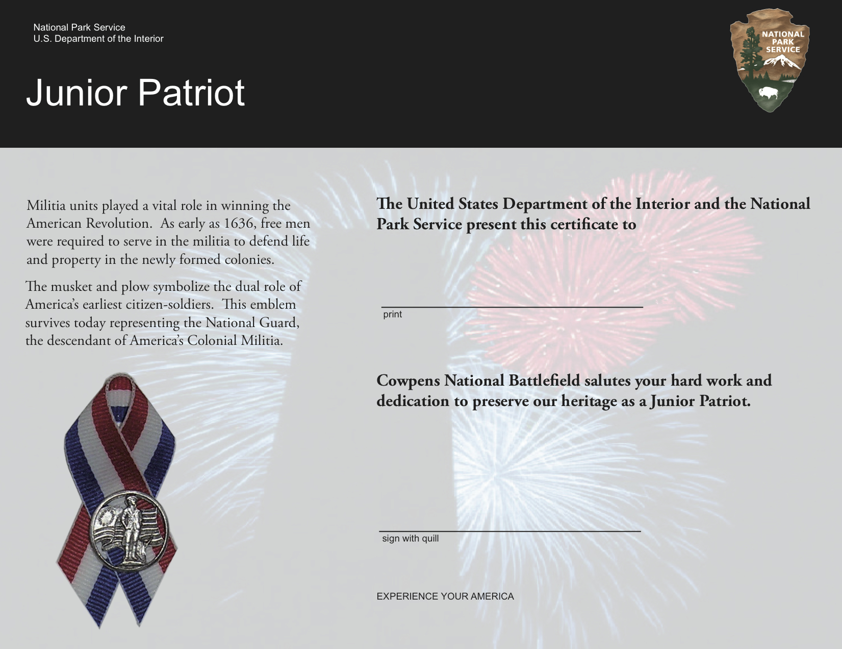
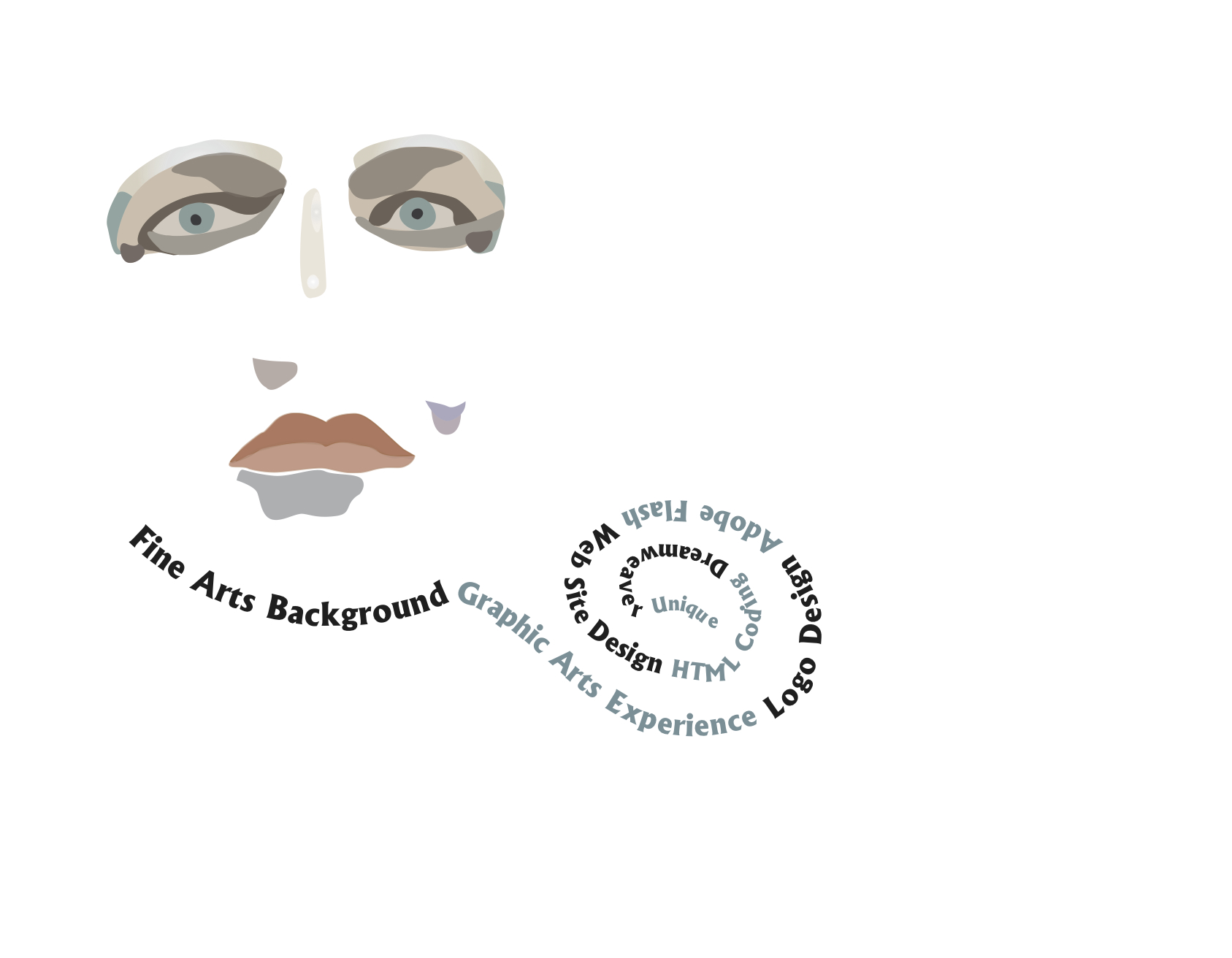
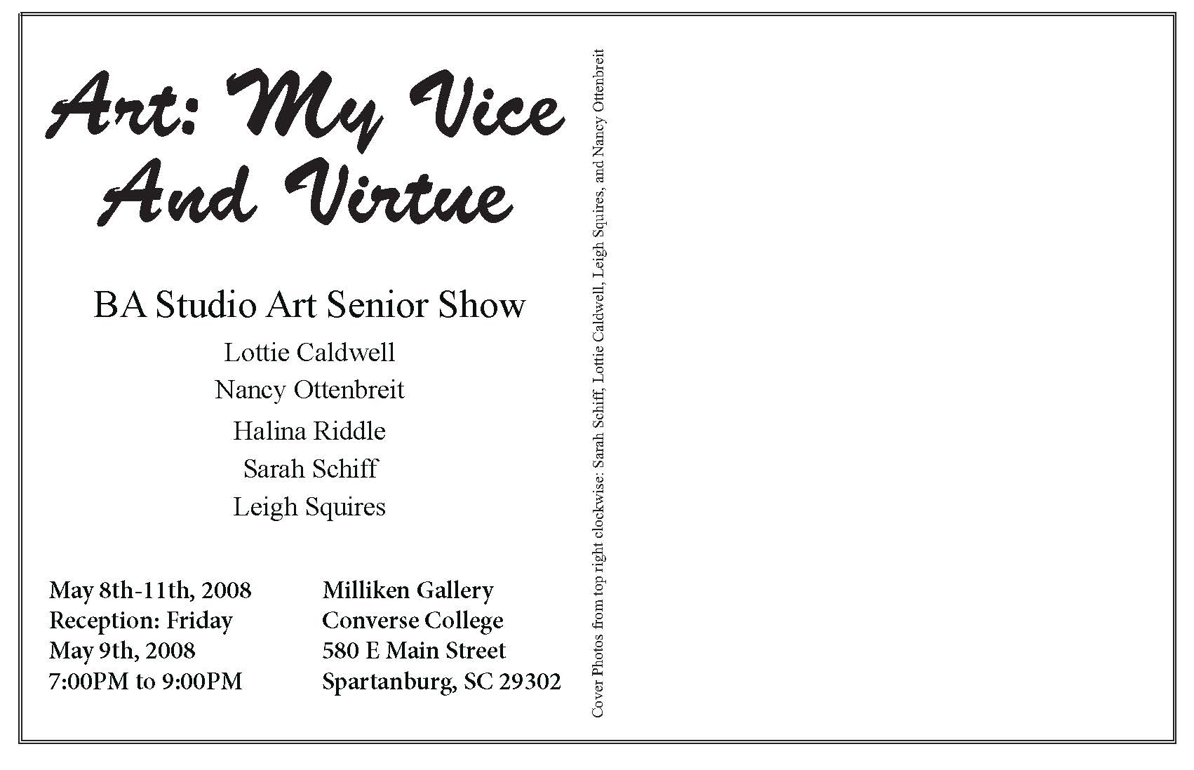
The idea behind the project in this class was to make-up any product that we wanted and create a name and three different logos that represented the qualities of the product.
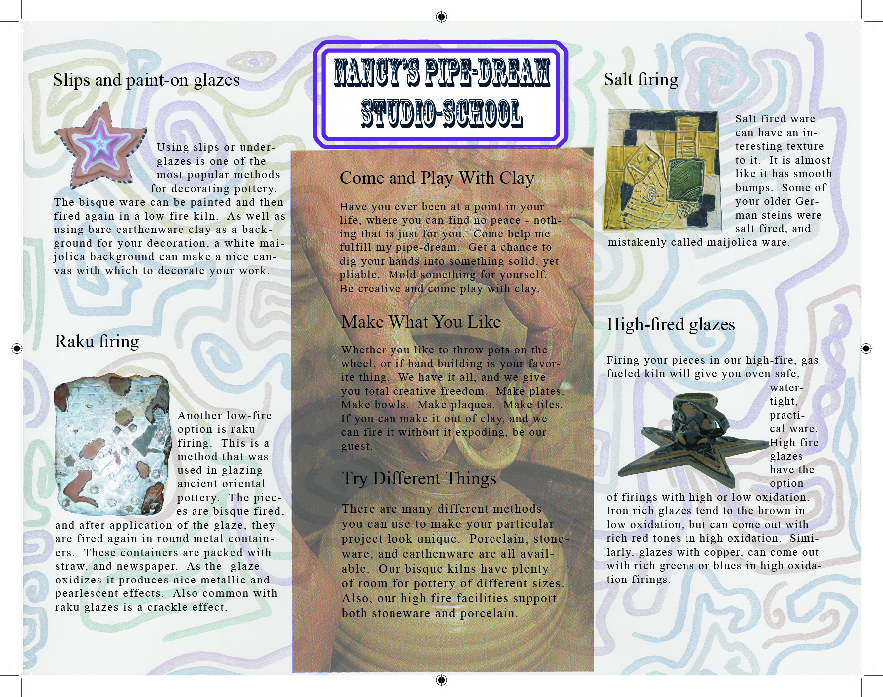
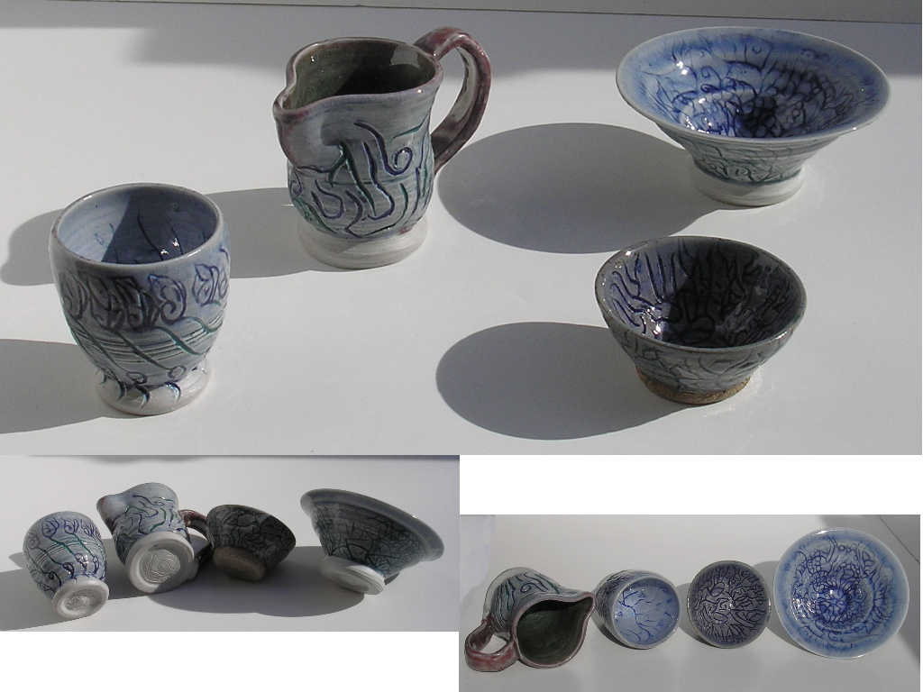
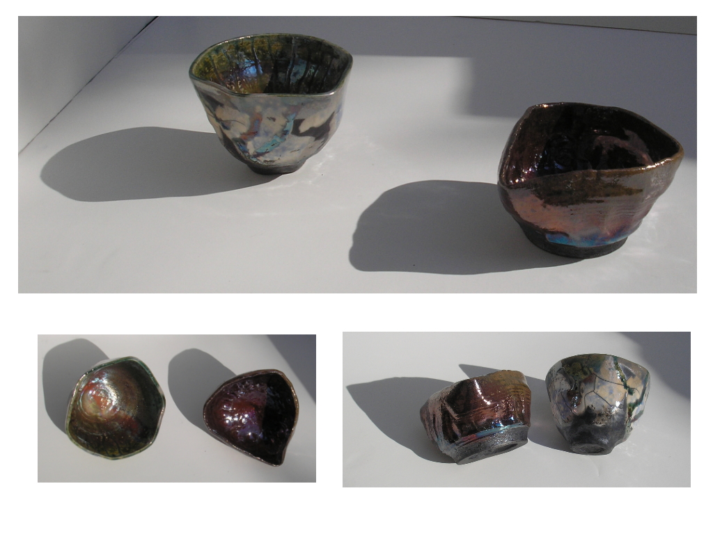
My inspiration was a type of clay that I used when I was studying ceramics. It was a white stoneware that was very quick and easy to throw on the wheel.
In coming up with the name, I also considered how stoneware is known as a sturdy clay-body, especially as opposed to porcelain, a clay with a very white color and less strength while the artist is working with it.
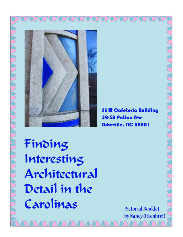
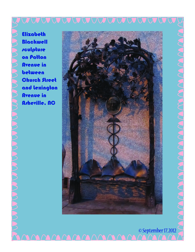
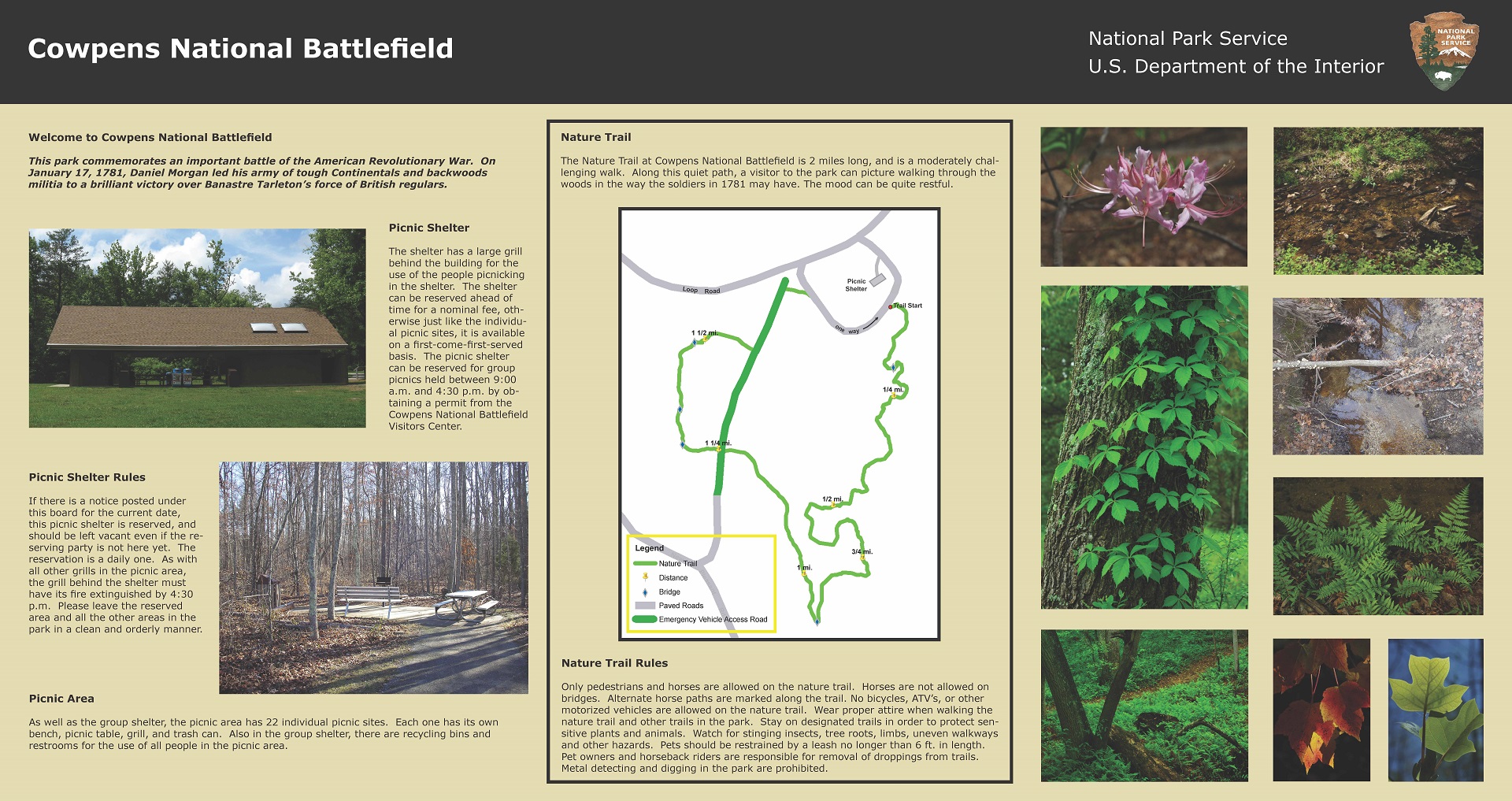
Above is a booklet done for one of my last classes. It was done with the Adobe program InDesign. I immensely enjoyed going around visiting places to take the photographs with my digital camera. I really found that I like Art Deco architectural detailing.
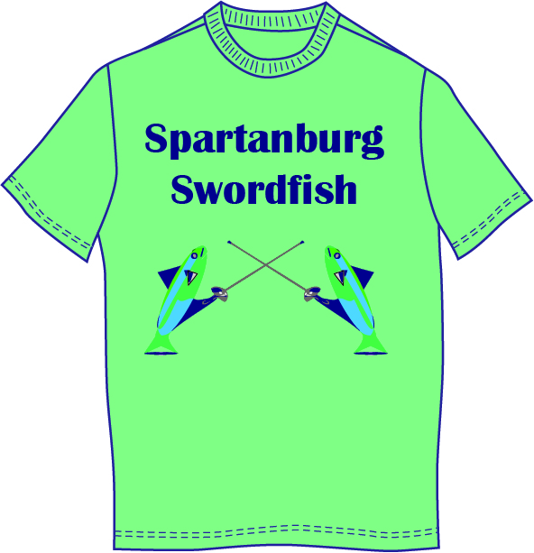
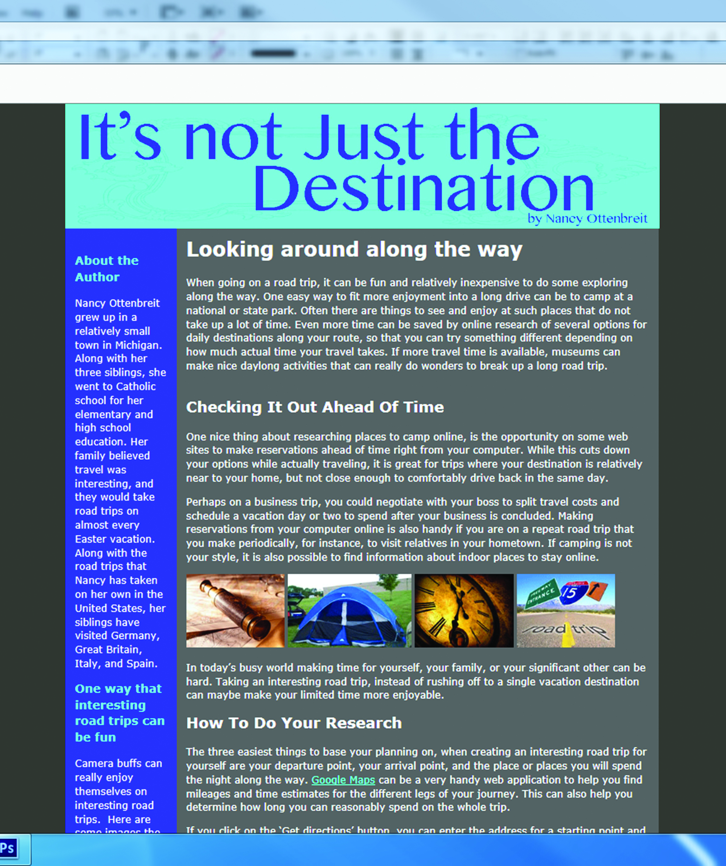
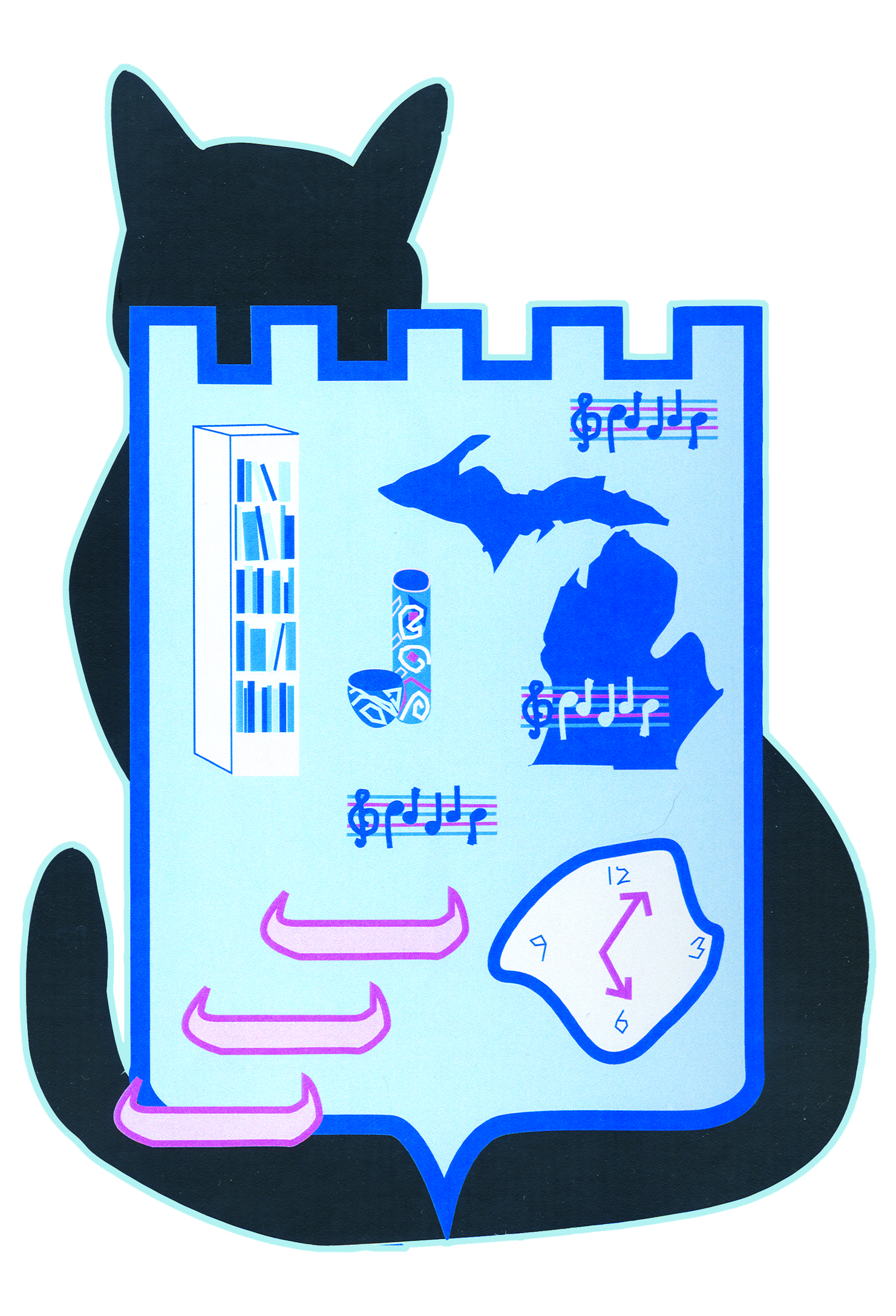
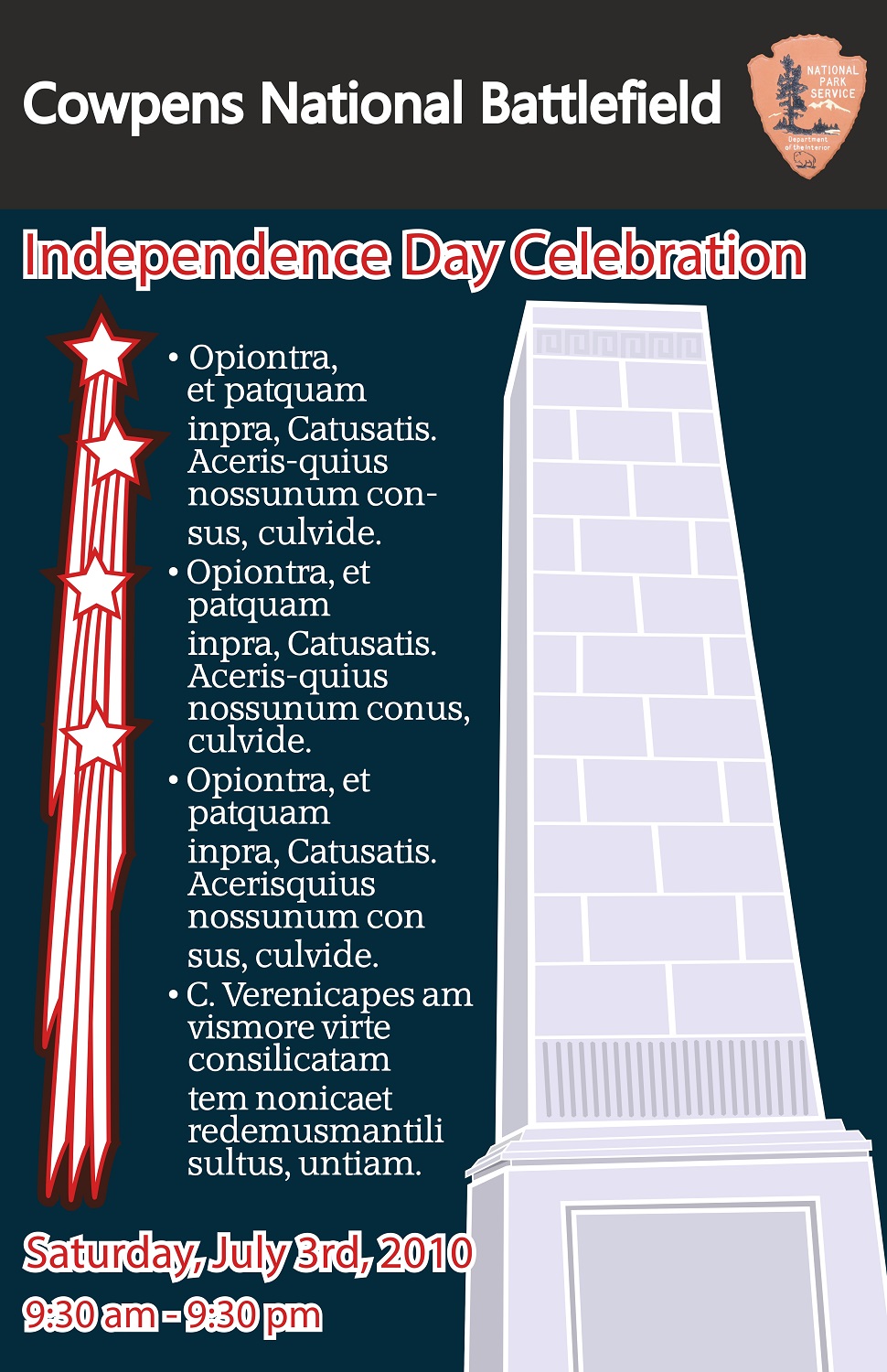
In my advertising design class, my fellow students and I came up with designs for billboards for the South Carolina state park of our choice.
I chose green to be my background color because of the natural surroundings at all of the state parks. In the first billboard, I also chose to emphasize history, because I believe it is an important and enjoyable part of many state and national parks.
We used approved images from the SC State Parks Web Site, so the clarity of the images is not good. The instructor did not worry about resolution, in this case, because the rendering on the computer screen was notfor printing on real billboards. This assignment was to give us some idea of what it would be like to design on such a large scale.


